Hey,
You know how some ads just stick with you? The ones that take a complex idea and make it feel simple, human, and even fun? This week I’m breaking down five campaigns that nailed that formula.
Think of this as a little coffee chat. I’ll tell you what the ad did, why it worked, and the key takeaways you can apply to your own marketing.
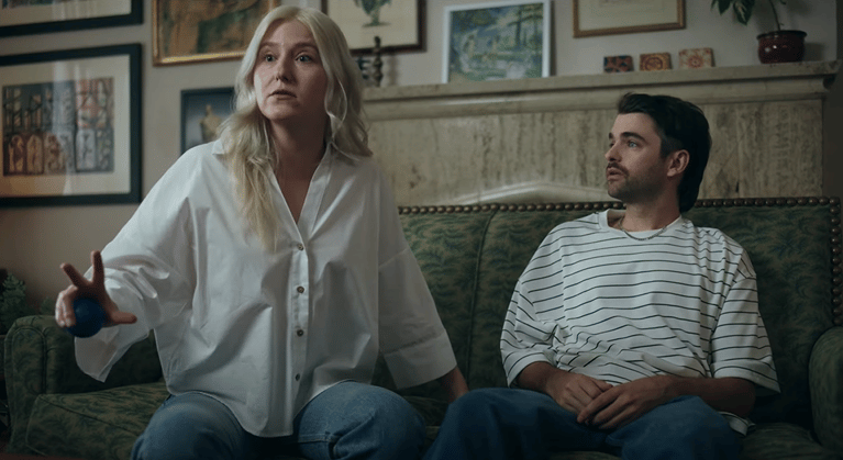
Air’s “Creative Couples Therapy” ad had me laughing immediately. A couple bickers in therapy, not about chores or in-laws, but about messy file names like final_final_v2_USE_THIS_ONE. And the therapist? Air, stepping in as the third partner to restore peace.
Why it works: nobody wants to sit through an explainer on “digital asset management.” But we all know the pain of hunting through endless folders. By turning that chaos into relationship drama, Air made a boring B2B issue feel human and funny.
The look seals it: warm lighting, retro office vibes, and pacing that mirrors the chaos → calm → resolution arc. And that “mind-reading” moment at the end? A perfect metaphor for AI-powered search.
Takeaway: Find the human drama inside your product’s problem. Your audience won’t remember “workflow optimization,” but they’ll remember the feeling of a broken relationship finally getting fixed.

[Click here to watch]
This one’s just fun. A modern marketer stressing over engagement numbers gets dropped into a dusty old bazaar. There, a pushy merchant sells her a bottle of “Customer Sense Oil” , basically snake oil for the digital age.
Why it works: the ad doesn’t just say “guessing what users want is bad.” It exaggerates it until it’s laughable. That laptop perched on a wooden barrel is the ultimate contrast, modern problems can’t be solved with medieval fixes.
Visually, it’s cinematic: earthy tones, authentic costumes, the bustle of a real market. Against that backdrop, the marketer’s frustration feels both ridiculous and real.
Takeaway: In your own campaigns, dramatize outdated methods until they’re laughable. Make the old way look absurd, and your solution becomes the only option.
Secure code training. Snooze, right? That’s exactly where Wizer starts: a developer slumped at his desk, staring at “Module 96” in a gray, soulless office. But then, bam! The world flips into a neon-soaked, Matrix-style action sequence where training feels like a game.
Why it works: Wizer gets developers. They know mandatory training is hated, ignored, and rushed. So instead of pitching “compliance,” they sell empowerment turning drudgery into something cool. The contrast between soul-crushing boredom and sci-fi energy makes the message land.
Visually, it’s a thrill ride: glowing code, hacker-movie pacing, a mentor figure straight out of The Matrix. It’s cinematic, but it’s also relatable, every developer wishes training felt this engaging.
Takeaway: Don’t just solve the problem, reimagine the experience. Show your audience not only what gets fixed, but how their lives feel better on the other side.
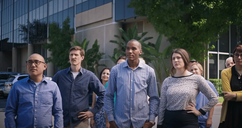
This one’s painfully funny. An executive proudly reveals a new company logo. Everyone in the room sees something wildly inappropriate and the silence is excruciating. Then, the punchline lands: Shoulda used SurveyMonkey.
Why it works: they never even show the product. Instead, they make the case for it by showing the nightmare of not using it. Every marketer and brand manager knows the fear of a launch gone wrong, and this ad puts that anxiety on screen with humor and just the right amount of cringe.
The genius is in the reactions, split-takes, horrified stares, awkward silence. No feature list needed; the audience already connects the dots.
Takeaway: Sometimes the smartest pitch is subtraction. Don’t show what your product does. Show the disaster without it and let your audience arrive at the solution themselves.
We’ve all been there: squinting at a CAPTCHA, wondering if that blurry blob is a bus or a stoplight. Vonage takes that tiny annoyance and blows it up into a full-on 1970s conspiracy thriller. A frantic man connects clues on a corkboard, losing his mind over CAPTCHA grids until the screen finally flips to a simple “Login approved.”
Why it works: it takes a universal frustration and dramatizes it to the extreme. For product managers and UX folks, CAPTCHAs aren’t just annoying; they cost conversions. By parodying that pain as a paranoia-fueled thriller, Vonage makes its solution (silent authentication) feel like pure, magical relief.
The details make it stick: moody lighting, frantic editing, a corkboard with red string. It’s cinematic, funny, and unforgettable, all about something as boring as login friction.
Takeaway: Even tiny pain points can carry big emotion. Blow them up, exaggerate them, and then show how your product makes the frustration vanish in an instant.
Why This Matters
Here’s the truth: your audience isn’t hunting for “workflow optimization” or “enterprise analytics.” They’re just trying to get work done without tripping over the same roadblocks every day.
The best ads work because they make those obstacles impossible to ignore. A messy file system becomes a couple in therapy. Guesswork becomes snake oil. CAPTCHAs become a conspiracy board. These stories don’t just describe the pain, they make you feel it.
And that’s the lesson: people don’t buy software. They buy relief. They buy the feeling of not having that headache anymore. The more vividly you can show the pain, the more satisfying your solution feels.
Try This Next Week
A few prompts to spark ideas for your next campaign:
If your customer’s problem were a character, who would it be?
How could you exaggerate the “old way” until it looks ridiculous?
What everyday setting (therapy, courtroom, game show) could you use as a metaphor?
What tiny frustration could you blow up into something hilariously unbearable?
The Pattern I’m Seeing
Every campaign that earns attention right now does this: it proves it understands the problem better than you do. Not with feature lists or case studies, but with stories that make people nod and laugh because they feel true.
Attention first. Trust second. Consideration third. Everything else is noise.
That’s a wrap for this week’s breakdowns. Hopefully a few of these sparked ideas for your own campaigns. The big theme? Don’t just talk about what your product does, show the story behind the problem you solve.
And if you’re hungry for more inspiration, we’ve built a whole library of video ads worth studying, from scrappy startups to big-budget productions. You can check it out here: B2B Video Ads Library.
Until next time, keep finding the drama in the details, that’s where the best marketing lives.
Black Camel Agency
Regan George | [email protected]
P.S. Found a B2B campaign that made you think “damn, I wish we’d made that”? Send it over. The ones that make me jealous get the full breakdown treatment.


